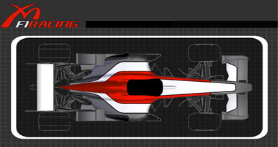
Midland’s Awful Colours
According to grandprix.com, Midland “…has also unveiled its new livery, a combination of white, silver grey and red, which has been chosen to differentiate the team from others in the F1 field.”
Ha! What a joke! Let’s have a look at the rest of the field with their different colours…
Toyota – Red, white and silver (on the driver’s overalls).
McLaren – Black and silver, with red flashes.
Ferrari – Red with white and some black lettering.
McLaren’s livery might be a little different next year with their Johnny Walker sponsorship, and we don’t yet know what the future holds for Williams, but if Midland really wanted to look different to the rest of the teams they could have stuck with the Jordan yellow. Or how about green? Then again, Jordan started out in green livery so they wouldn’t want that.. But there are just so many other colours out there that would certainly make the team stand out.. Purples, oranges, different shades of blue (aqua even?), pink (ok, maybe not), chequered, mirrorball, polka-dot.. anything! ![]()
Strangely the team will be called MF1 Racing instead of Midland..
At the end of the day I’d say a nice light blue and white would be the best colours for them. I mean look at their corporate colours:

Compared with their car colours for next year:

This livery looks like it represents this Midland Group and not this Midland Group (the F1 one). Oh well.. so long as they don’t get confused with this Midland Group ( is that the best web site you’ve ever seen!? ![]() Hmm.. maybe the light blue and white car was a bad idea.. )
Hmm.. maybe the light blue and white car was a bad idea.. )


